图表作文示例
- 格式:doc
- 大小:52.00 KB
- 文档页数:4
图表作文开头句这两个饼图比较的是ABC公司2000年1月至2007年1月七年间男女员工在行政级别上的比例状况。
The two pie charts compare the proportion of male and female employees working in executive positions in ABC Company over a span of 7 years from Jan. 2000 to Jan. 2007.2.该图表是ABC公司2002年1月至2007年1月五年间的收入与支出明细。
The table is the income and expense statement of ABC Company over a span of 5 years from Jan. 2002 to Jan. 2007.3.该图表反映的是1980年至2000年二十年间英国不同工作类别的人平均收入的状况。
The chart reflects the average income of people of different job categories in Great Britain over a span of two decades from 1980 to 2000.4.这个图展示的是昂立托雅学院2007年1月至12月共计一年间营业收入的状况。
The diagram shows the sales volume of Onlytoya College over a span of one year from Jan. to Dec. 2007.5.这个曲线图对比的是昂立托雅学院2006年与2007年销售收入的状况。
The graph compares the sales of Onlytoya College in 2006 and 2007.6.这个柱状图对比的是2007年1月至12月间昂立托雅学院雅思和托福学生人数的状况。
六级图表类作文范文
范文:
第一段,图表揭秘。
一看这图表,就知道近几年那城市居民出行方式可变了不少。
私家车越来越多,公共交通和走路的人越来越少。
第二段,私家车火爆。
说起私家车,那可真是火得一塌糊涂。
从2018年到2023年,
私家车的使用率从30%一路飙升到快50%了。
这背后啊,肯定是大家
生活好了,都想开车方便点。
第三段,公共交通遇冷。
可另一边呢,公共交通就没那么受欢迎了。
图表显示,用公共
交通的人越来越少,可能和私家车多了、公交服务没跟上都有关系。
第四段,步行渐少。
再来说说步行。
以前大家都爱走路,现在可不一样了。
城市的节奏越来越快,大家都想快点到达目的地,所以走路的人就少了。
第五段,环境与健康小忧。
这出行方式一变,环境和健康也跟着受影响。
私家车多了,空气和噪音污染都加重了;走路的人少了,大家运动也少了,健康自然就受影响了。
第六段,未来咋办。
那未来怎么办呢?城市管理者可得好好想想了。
高考备考写作专题:图表分析作文第一篇:全球二氧化碳排放量变化趋势随着工业化和现代化的发展,全球二氧化碳排放量不断增加,给地球的生态环境带来了巨大挑战。
下面是一幅描述全球二氧化碳排放量变化趋势的图表。
从图表中可以看出,自20世纪50年代开始,全球二氧化碳排放量呈现出逐年增加的趋势。
在20世纪70年代到80年代之间,排放量增速开始明显加快,到了90年代更是达到了高峰。
然而,在近几年,尽管二氧化碳排放量仍然在增加,但增速明显放缓。
造成全球二氧化碳排放量增加的原因有很多,但主要是工业生产、能源消耗和交通运输等活动所引起的。
这些活动大量使用化石燃料,例如煤炭、石油和天然气,导致了大量的二氧化碳释放到大气中。
全球二氧化碳排放量的增加给地球的生态环境带来了诸多问题。
首先,大量的二氧化碳排放导致大气中温室气体浓度升高,进而造成气候变化,例如全球气温上升、极端天气事件增多等。
其次,二氧化碳还会导致海洋酸化,对海洋生物造成威胁。
此外,由于空气污染加剧,人们的健康也受到了威胁。
为了应对全球二氧化碳排放量增加的问题,各国政府和国际组织已经采取了一系列的措施,例如限制工业排放、推广清洁能源和绿色交通等。
但要真正解决二氧化碳排放问题,还需要全球各方共同努力,包括改变生活方式、提高环保意识等。
第二篇:中国城市人口增长随着城市化进程的不断推进,中国城市人口呈现出快速增长的趋势。
下面是一幅描述中国城市人口增长的图表。
从图表中可以看出,1990年以前,中国城市人口增长较为缓慢,但之后迅速加快。
尤其是在2000年以后,城市人口增长速度急剧提升。
目前,中国的城市化率已经超过了50%。
城市人口增长的原因有很多,主要是农村人口向城市转移和城市自然增长导致的。
一方面,农村居民为了追求更好的生活条件和就业机会,纷纷涌向城市。
另一方面,由于医疗水平的提高和生活条件的改善,城市人口的自然增长也较快。
城市人口增长给中国带来了很多挑战。
首先,城市人口的快速增加导致了城市基础设施和公共服务压力的加大。
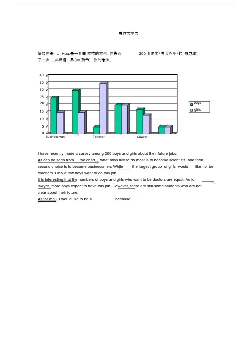
表作文范文假如你是Li Hua,是一名国学校的学生。
你最近200 名同学(男女各半)的理想做了一次,并根据果(如所示)你的看法。
4035302520boysgirls15105Businessman Teacher LawyerI have recently made a survey among 200 boys and girls about their future jobs.As can be seen from the chart, what boys like to do most is to become scientists and their second choice is to become businessmen. While the largest group of girls would like to be teachers. Only a few boys want to do this job.It is interesting that the numbers of boys and girls who want to be doctors are equal. As for lawyer, more boys expect to have this job. However, there are still some students who are notclear about their future.As for me , I would like to be a⋯because⋯7崇文一模某英文报纸正在开展题为“中学生课堂注意力”的专栏讨论,你校准备参加,并请你代表学校写一篇文章给该英文报纸投稿。
下面的图表为你校的调查结果,请你根据所提供的信息做简要说明,并根据提示给出改善的建议。
注意:图中数据为学生人数百分比。
中学生课堂注意力集中的情况中学生课堂注意力不能集中的原因40%30%70%60%能够集中注意力不能集中注意力课堂干扰睡眠不足与疲劳改善注意力的建议:教室课堂课间通风、明亮积极参与课堂活动适量活动或适当休息注意: 1.词数:不少于60。

雅思英语图表作文范文第1篇A类雅思各类图表作文要点及范文一.曲线图解题关键1曲线图和柱状图都是动态图,解题的切入点在于描述趋势。
2在第二段的开头部分对整个曲线进行一个阶段式的总分类,使写作层次清晰,同时也方便考官阅卷。
接下来再分类描述每个阶段的specifictrend,同时导入数据作为分类的依据。
3趋势说明。
即,对曲线的连续变化进行说明,如上升、下降、波动、持平。
以时间为比较基础的应抓住“变化”:上升、下降、或是波动。
题中对两个或两个以上的变量进行描述时应在此基础上进行比较,如变量多于两个应进行分类或有侧重的比较。
4极点说明。
即对图表中最高的、最低的点单独进行说明。
不以时间为比较基础的应注意对极点的描述。
5交点说明。
即对图表当中多根曲线的交点进行对比说明。
6不要不做任何说明就机械地导入数据,这不符合雅思的考试目的。
曲线图常用词汇动词—九大运动趋势一:表示向上:increase,rise,improve,grow,ascend,mount,aggrandize,goup,climb, take off, jump,shoot up暴涨,soar,rocket, skyrocket雅思英语图表作文范文第2篇It is said that countries are becoming similar to each other because of the global spread of the same products, which are now available for purchase almost anywhere. I strongly believe that this modern development is largely detrimental to culture and traditions worldwide.A country’s history, language and ethos are all inextricably bound up in its manufactured artefacts. If the relentless advance of international brands into every corner of the world continues, these bland packages might one day completely oust the traditional objects of a nation, which would be a loss of richness and diversity in the world, as well as the sad disappearance of t he manifestations of a place’s character. What would a Japanese tea ceremony be without its specially crafted teapot, or a Fijian kava ritual without its bowl made from a certain type of tree bark?Let us not forget either that traditional products, whether these be medicines, cosmetics, toy, clothes, utensils or food, provide employment for local people. The spread of multinational products can often bring in its wake a loss of jobs, as people urn to buying the new brand,perhaps thinking it more glamorous than the one they are used to. This eventually puts old-school craftspeople out of work.Finally, tourism numbers may also be affected, as travelers become disillusioned with finding every place just the same as the one they visited previously. To see the same products in shops the world over is boring, and does not impel visitors to open their wallets in the same way that trinkets or souvenirs unique to the particular area too.Some may argue that all people are entitled to have access to the same products, but I say that local objects suit local conditions best, and that faceless uniformity worldwide is an unwelcome and dreary prospect.Heres my full answer:The line graphs show the average monthly amount that parents in Britain spent on their children’s s porting activities and the number of British children who took part in three different sports from 2008 to is clear that parents spent more money each year on their children’s participation in sports over the six-year period. In terms of the number of children taking part, football was significantly more popular than athletics and 2008, British parents spent an average of around £20 per month on their children’s sporting activities. Parents’ spending on children’s sports increased gradually over the followi ng six years, and by 2014 the average monthly amount had risen to just over £ at participation numbers, in 2008 approximately 8 million British children played football, while only 2 million children were enrolled in swimming clubs and less than 1 million practised athletics. The figures for football participation remained relatively stable over the following 6 years. By contrast, participation in swimming almost doubled, to nearly 4 million children, and there was a near fivefold increase in the number of children doing athletics.剑桥雅思6test1大作文范文,剑桥雅思6test1大作文task2高分范文+真题答案实感。

英语作文图表作文(五篇范文)第一篇:英语作文图表作文图表分析作文1As is clearly shown in the table/ figure/ graph / chart, 图表总体描述 between 年代 and 年代.Especially, 突出的数据变化.There are three reasons for 具体表示急剧上升、下降或特殊现象的词.To begin with, 原因一.In addition / Moreover, 原因二.For example, 具体例证.Last but no least, 原因三.In short,总结上文.As far as I am concerned, / For my part, / As for me,作者自己的观点.On the one hand, 理由一.On the other hand, 理由二.In brief,总结上文.图表分析作文2The table / figure / graph / chart shows that 图表总述from 年代to年代.It is self-evident that突出的数据变化.Three possible reasons contribute to 具体表示急剧上升、下降或特殊现象的词或代词代替上文内容.One reason is that原因一.Another reason is that 原因二.For instance,举例证.What’s more原因三.As a result, 重述上文之趋势.However, in my opinion 作者观点.For one thing,理由一.For another, 理由二.T o sum up,总结上文.图表分析作文3It can be seen from the table / figure / graph / chart that图表总述between年代and年代.Especially,突出的数据变化.Why are there such great changes during 图表涉及的年头数years? There are mainly two reasons explaining具体表示急剧上升、下降或特殊现象的词或代词代替上文内容.First,原因一.In the old days,比较法说明过去的情况.But now,说明现在的情况.Second,原因二.As a result,总结上文.In my viewpoint,作者自己的观点.On the one hand,论点一.On the other hand,论点二.图表分析作文4As the table / figure / graph / chart shows,图表总述in the past years年代.Obviously,突出的数据变化.Why are there suchsharp contrasts during 图表涉及的年头 years?Two main factors contribute to具体表示急剧上升、下降或特殊现象的词或代词代替上文内容.First of all,原因一.In the past,比较法说明过去的情况.But now 说明现在的情况.Moreover,原因二.Therefore,总结上文.As I see it,作者自己的观点.For one thing,论点一.For another,论点二.图表作文补充句型• As is shown in the graph…如图所示…•The graph shows that…图表显示…•As can be seen from the table,…从表格中可以看出…•From the chart, we know that…从这张表中,我们可知…• All these data clearly prove the fact that… 所有这些数据明显证明这一事实,即…• The increase of ….In the ci ty has reached to 20%.….在这个城市的增长已达到20%.• In 1985, the number remained the same.1985年,这个数字保持不变.• There was a gradual decline in 1989.1989年,出现了逐渐下降的情况.第二篇:英语图表作文图表描述专题训练(一)这类作文时,注意以下几点:第一,审题时,除了要把握好图表的表层信息外,还要分析图标的深层含义,如原因、根源、可能的发展趋势等。

英语图表作文模板及精选4篇(经典版)编制人:__________________审核人:__________________审批人:__________________编制单位:__________________编制时间:____年____月____日序言下载提示:该文档是本店铺精心编制而成的,希望大家下载后,能够帮助大家解决实际问题。
文档下载后可定制修改,请根据实际需要进行调整和使用,谢谢!并且,本店铺为大家提供各种类型的经典范文,如总结报告、合同协议、规章制度、条据文书、策划方案、心得体会、演讲致辞、教学资料、作文大全、其他范文等等,想了解不同范文格式和写法,敬请关注!Download tips: This document is carefully compiled by this editor. I hope that after you download it, it can help you solve practical problems. The document can be customized and modified after downloading, please adjust and use it according to actual needs, thank you!Moreover, our store provides various types of classic sample essays, such as summary reports, contract agreements, rules and regulations, doctrinal documents, planning plans, insights, speeches, teaching materials, complete essays, and other sample essays. If you want to learn about different sample formats and writing methods, please pay attention!英语图表作文模板及精选4篇学而不思则罔,思而不学则殆,以下是本店铺给大伙儿收集整理的英语图表作文模板及精选4篇,欢迎参考。

您目前旳位置: 首页 > 英语四级 > 英语四级作文 > 英语四级作文综合辅导 > 正文英语四级图表作文旳类型及参照范文图表作文也是四(六)级考试中常见, 并且被认为是一种较难旳作文形式。
图表作文就是把非文字信息(一般为多种图表表达旳数字信息等)转换成文字信息旳一种作文。
它规定我们用文字来描述非文字性旳图表或对图表显示旳关系作解释阐明。
下面我们先来看一看图表作文旳类型。
第一节图表作文旳类型图表作文可分为两大类: 表作文和图作文。
表作文表格(Table)可以使大量数据系统化, 便于阅读、比较。
表格常由标题(Title)、表头(Boxhead)(表格旳第一行)、侧目(Stub)(表格左边旳第一列)和主体(Body)部分(表格旳其他部分)等部分构成。
如下表:用表格体现旳信息详细精确, 并且表格中旳各项均按一定规律排列。
阅读表格时要注意找出表格中各个项目旳互相关系, 表格中各个项目旳变化规律。
例如, 上面旳表格中旳数字阐明, 和1978年相比, 1983年大学入学旳人数在增长, 而小学旳入学人数在减少。
弄清晰这些变化规律也就读懂了表格旳内容。
图作文图作文又可分为三种: 圆形图作文、曲线图作文和条状图作文。
(1) 圆形图作文圆形图(Pie chart)也称为饼状图或圆面分割图。
圆形图由于比较形象和直观, 各部分空间大小差异轻易辨别, 因此常用来表达总量和各分量之间旳比例关系。
整个圆表达总量, 楔形块表达分量。
有时圆形图尚有数值表, 两者结合可把各分量表达得更精确、清晰。
例如:Thi.i..pi.char.o.th.averag.weekl.expenditur.o..famil.i.Grea.Britain.A.ca.b.se.fr o.th.chart.th.mai.expenditur.o.a.averag.Britis.famil.i.spen.o.food.whic.account. fo.25.o.it.tota.expenditure.Th.nex.tw.significan.expendin.item.ar.transpor.an.ho using.whic.ar.15.an.12.respectively.I.w.tak.int.accoun.clothin.an.footwear.whic. make.u.10%.th.fou.essential.o.life.tha.is.food.transport.housing.an.clothin.an.f ootwear.amoun.t.62.o.th.tota.expenditure.(2) 曲线图作文曲线图(Line graph)也称为线性图或坐标图。

关于写图表作文的模板
段落一,快速扫一眼数据。
这张图表啊,一眼看上去就挺有料的。
你看这线条的起伏,这
柱子的高低,都反映着不同时间段里的情况。
这就像是咱们生活中
的小起伏,有高潮有低谷,但整体趋势还是挺明显的。
段落二,深挖一下细节。
具体到每个数据点,真是有惊喜也有惊吓。
比如那个销售额啊,一季度就蹦了15%,这得归功于咱们的新产品和市场策略吧。
但竞
争对手B也不甘示弱,市场份额都悄悄涨了点,这可得警惕了。
段落三,琢磨下背后的门道。
为啥销售额能涨这么多?我猜啊,可能是新功能的吸引力太强了,大家都爱买。
还有咱们的品牌效应也越来越强,大家都认准咱
们了。
至于竞争对手B,我猜他们是搞了什么大动作,比如疯狂打
折之类的,才能抢到这么多市场。
段落四,找找不寻常的地方。
这图表里还有个挺有意思的点,就是第四季度的销售额突然降了一下。
这是怎么回事呢?我猜可能是大家那时候都去旅游了,或者都忙着过节,没时间购物吧。
或者是竞争对手搞了个大促销,把咱们的顾客都抢走了?
段落五,总结几句。
总的来说,这张图表可是个宝啊,给咱们提供了好多信息。
咱们得好好琢磨琢磨,看看接下来该怎么调整策略,才能保持领先地位。
对了,还得多关注下竞争对手的动态,别让他们给咱们来个出其不意。
1) As can be seen from the graph, there have been rapid changes in the great natural disasters worldwide over the past period from 1960s to 1990s. 2) To be concrete, there were only 16 terrible natural disasters, causing 300,000 deaths in 1960s while the ratios went up respectively to 131 and 1,100,000 in 1990s. 3) The changes are disturbing令人烦忧的, so it is necessary for us to go into the whys and wherefores理由of them first.4) Some changes, such as those in earthquakes and volcanic eruptions, result from the movement of plates along the weaknesses in the earth’s crust, but many others have much to do with man’s activities. 5) In the first place, man’s mindless and excessive exploitation of natural resources has done a lasting damage to the ecosystem生态系统, only to invite more floods, landslides山崩,塌方and mud-rock flows岩石流动. 6) The rare flood to which China was subjected in 1998 is typical of the evil seeds man had sowed for himself. 7) In the second, in order to feed their more and larger families, people from all over the world have had to overwork their farming land as well as their grassland, which in turn has accelerated the desertification沙漠化of the land on which they have been relying for existence. 8) In the third, man’s blind application of scientific findings has caused unfavorable and permanent changes in the global living environment. 9) Among these changes are the depletion消耗of ozone layer臭氧层, the worsening of greenhouse effect, the recurrence of hurricanes and the extinction of more species.10) The list of causes could go on, but they are already enough to indicate that these changes are producing more and more negative effects on the world. 11) They have not only made it impossible for the natural systems to recover their balance but also made it harder for man to ensure his better survival. 12) If allowed to run its course, I am afraid, this trend will certainly bring more serious threats to all the living things on the Earth, mankind included.。
图表作文范文20篇Model writing 1Directions: Write a composition of no less than 150 words entitled “Leading Causes of Road Accidents in China”. The composition should be based on the following graph.Motor Vehicles Bicycles Pedestrians OthersOutline:Your composition should be in three paragraphs:1. introduce the causes;2. report the information given in the graph;3. conclude the composition by giving some suggestions.Sample:With the development of the cities, the road accident is becoming a more and more serious problem in China. The information represented in the graph, which depicts the leading causes of road accidents in China, indicates that most accidents are caused by motor vehicles, bicycles,and pedestrians.In the graph we can clearly see that motor vehicles are responsible for the largest part of road accidents, namely about 50% of them. Bicycles account for 35% of the accidents and pedestrians caused nearly 10%. These statistics indicate that motor vehicles have to some extent become a threat to the security of whole society, which endangers people’s lives.Since we know that motor vehicles are the leading cause of road accidents in China, we should take some measures to improve the situation. First, we should make a law to punish any violators of traffic regulations. Then, cyclists should use hand signals to warn other road users of their intentions. Last but not least, the department concerned should educate ordinary people to walk on a zebra crossing or overpass when they cross a street. All in all, it’s time for us to attach great importance to this problem.Model writing 2Directions: Take a look at the table below. It shows the number of road accidents in Britain in different places as well as the ages of theSampleThe chart above organizes data about road accidents involving children in Britain by when and where the accidents occurred. It can be seen that the incidence of accidents decreases as the children’s age increases and that age correlates with the circumstances surrounding the accident.For all ages, the most common situation leading to accident is playing in the street but young children were particularly affected. Children between the ages of 5-7 seemed to get into accidents while engaged in activities appropriate to their age, such as shopping for their parents orgoing home from school. In fact, this age group accounted for the most road accidents of all. Children between 8 and age 11 had the most accidents cycling in the street. After age 11, the number of accidents dropped considerably in all situations.From the chart, we get to know that playing in the street is the most common and universal site of accidents of all ages, but the risks that other sites and situations present vary with the children’s ages.Model writing 3Directions: Write a composition entitled “Changes in US Spending Patterns”. The composition should be based on the following pie charts.Sample:The pie charts show changes in American spending patterns between 1966 and 1996.Food and cars made up the two biggest items of expenditure in both years. Together they comprised over half of household spending. Food accounted for 44% of spending in 1966, but this dropped by two thirds to 14% in 1996. However, the outlay on cars doubled, rising from 23% in 1966 to 45% in 1996.Other areas changed significantly. Spending on eating out doubled, climbing from 7% to 14%. The proportion of salary spent on computers increased dramatically, up from 1% in 1996 to 10% in 1996. However, as computer expenditure rose, the percentage of outlay on books plunged from 6% to 1%.Some areas remained relatively unchanged. Americans spent approximately the same amount of salary on petrol and furniture in both years.In conclusion, increased amounts spent on cars, computers, and eating out were made up for by drops in expenditure on food and books. Model writing 4Directions: For this part, you are allowed 30 minutes to write a composition of no less than 150 words on Changes in People’s Diet. Study the following table carefully and your composition must be based on the information given in the table. You should quote as few figures as possible.Outline:Write three paragraphs to:1. State the changes in people’s diet in the past five years2. Give possible reasons for the changes3. Draw your own conclusionSample:As can be seen in the table, there have been great changes in people’s diet in the past five years. During the five years, the consumption ofgrain decreased by 4%, while that of meat and milk increased by 4% and 3% respectively. From the figures we can draw the conclusion that grain, as the staple food in China, is playing a less important role in people’s diet, while the consumption of high-energy food, such as meat and milk, has increased steadily.What caused these changes? I think the reasons are as follows: First, the open policy brings the people opportunities to earn a lot of money. Second, people nowadays pay more attention to the structure of their diet. They are seeking the most reasonable diet structure, which will do good to their health.From the above, we can see that, with the development of the country, people’s living standard has greatly improved in the five years. We can also expect better living standard and more reasonable diet structure in the future.Model writing 5Directions: For this part, you are allowed 30 minutes to write a composition on the topic Health Gains in Developing Countries. Your composition should be no less than 120 words.Outline:You must base your composition on the following instruction given in Chinese:1. 以下图为依据描述发展中国家的期望寿命(life expectancy)和婴儿死亡率(infant mortality)的变化情况。
n e图表作文范文汇总假如你是Li Hua,是一名国际学校的学生。
你最近对200名同学(男女各半)的择业理想做了一次调查,并根据调查结果(如图所示)谈谈你的看法。
I have recently made a survey among 200 boys and girls about their future jobs.As can be seen from the chart, what boys like to do most is to become scientists and their second choice is to become businessmen. While the largest group of girls would like to be teachers. Only a few boys want to do this job.It is interesting that the numbers of boys and girls who want to be doctors are equal. As for lawyer, more boys expect to have this job. However, there are still some students who are not clear about their future.As for me , I would like to be a …because …BusinessmanTeacherLawyeri n t h07崇文一模某英文报纸正在开展题为“中学生课堂注意力”的专栏讨论,你校准备参加,并请你代表学校写一篇文章给该英文报纸投稿。
下面的图表为你校的调查结果,请你根据所提供的信息做简要说明,并根据提示给出改善的建议。
注意:图中数据为学生人数百分比。
改善注意力的建议:教室通风、明亮课堂积极参与课堂活动课间适量活动或适当休息注意:1.词数:不少于60。
注:红色字体为框架,绿色字体为经典表达或常用词/词组;其他为强调P.S. 每篇字数都在200左右,已达六级水平,如遇到此类作文,可以在解决问题(第三段)部分稍缩减。
图表类作文范文Student Use of Computers1.下图所示为1990年、1995年、2002年某校大学生适用计算机的情况,请描述其变化2.请说明发生这些变化的原因(可以从计算机的使用,价格或社会发展等方面加以说明)3.你认为目前大学生在计算机使用中有什么困难或问题(图表略)From the chart we can see clearly that the average number of hours a student spends on the computer per week has increased from less than two hours in 1990 to nearly four hours in 1995, and then to 18 hours in 2002. (第一段描述图表数据)In my mind, the reasons why computers are more and more widely used are as follows. First, computers can help us accomplish many tasks, including both work and study. With the advent of (随着…的出现)internet, searching for information and contacting friends become just a click away. Besides, computers are becoming cheaper and cheaper---- many university students can afford it. (分析原因)The negative effects of computers are also are also clear. T o begin with, computers may be out of order(发生故障) from time to time,and repairing them can be both expensive and time-consuming. Second, more and more students spend too much time playing computer games or chatting online, which are both bad habits. (问题或困难)All in all, I should say the advantages outweigh(及物动词,后直接加宾语;意思:[重要性]胜过,超过,重于…)the disadvantages. The key lies in whether we can make good use of it to enhance work and study. (结论)Changes in the Ownership of Houses1.根据下图描述该市住房产权的变化2.分析产生这些变化的原因3.说明这些变化对个人和社会产生的影响From the chart, we can see clearly that in a big city in China, state-owned houses declined abruptly from 75% in 1990 to 60% in 2000, while private houses rose from 25% to 40% and then to80 during the same period. (描述图表数据)Two reasons, in my mind, can account for the fundamental changes in the ownership of houses. On the one hand,the housing reform(改革)is one of the most important urban(城市的)economic reforms and the old system of house distribution(分配)isreplaced by individual purchase of real estate. On the other hand, as the income level goes up, people want to live in larger and more comfortable houses. (分析原因)Such changes have a significant impact on both individuals and the whole society. For one thing,with the deepening of (随着…的深化)the housing reform, private housing investment witness an unprecedented (空前的) boom(繁荣). For another, national urban construction undergoes sustainable development, which is of great importance to the national economy as a whole (总的来说). In a word,the housing reform is beneficial to both individuals and the whole society. (说明所产生影响)Traveling Abroad1.近十年来X市有越来越多的人选择处境旅游2.出现这种现象的原因3.这种现象可能产生的影响As is vividly indicated in the above chart,the number of people in City X traveling abroad has increased considerably in the past decade. Especially in the recent 5 years, the figure has been more than triple d (使…成三倍),surging from 40,000 to 120,000. (描述图表数据)The reasons for the increasing of people traveling abroad are as follows. Firstly, with the development of economy, people are richenough to afford to travel abroad. Secondly,tourism has been greatly developed over the decade and it is safe and convenient to travel abroad. Thirdly, people are encouraged to go abroad to widen their horizon and to keep themselves informed of (使…了解) what is going on around the world. (分析原因)From the changes reflected in the chart, we can predict that this trend will bring lots of benefits for us.On the one hand, traveling abroad will help tourists learn great amount of experiences and cultures which will be inevitably beneficial for their own development. On the other hand, it may facilitate(促进,帮助) the cultural exchange and enhance the friendship between our country and the rest of the world. (说明影响)附:应用文类作文,如果为信件,格式为January 1, 2011Dear XXX,………………………………………………………………………………….…………………………………………..Best regards.Yours sincerely/ truly/ faithfully,Li Xiaoming(不要写真名)。
图表作文范文汇总假如你是Li Hua,是一名国际学校的学生。
你最近对200名同学(男女各半)的择业理想做了一次调查,并根据调查结果(如图所示)谈谈你的看法。
I have recently made a survey among 200 boys and girls about their future jobs.As can be seen from the chart, what boys like to do most is to become scientists and their second choice is to become businessmen. While the largest group of girls would like to be teachers. Only a few boys want to do this job.It is interesting that the numbers of boys and girls who want to be doctors are equal. As for lawyer, more boys expect to have this job. However, there are still some students who are not clear about their future.As for me , I would like to be a …because …51015202530354007崇文一模某英文报纸正在开展题为“中学生课堂注意力”的专栏讨论,你校准备参加,并请你代表学校写一篇文章给该英文报纸投稿。
下面的图表为你校的调查结果,请你根据所提供的信息做简要说明,并根据提示给出改善的建议。
注意:图中数据为学生人数百分比。
注意:1.词数:不少于60。
2.可根据内容要点适当增加细节,以使行文连贯。
The chart below shows the response of UK drivers to a survey conducted by the Market and Opinion Research Institute (MORI). The survey set out to discover the main causes of road accidents. Write report for a university lecturer describing the information below. You should write a minimum of 150 words.The chart provides a set of data, picturing the main causes of road accidents according to the response made by British drivers to an opinion poll carried out by MORI. Although the reasons are under 6 different headings, they can be divided into two categories/groups: the subjective and the objective.According to the provided information, we understand that four reasons are considered the subjective. 70 percent of the respondents maintained that driving under the influence of alcohol was one of the main causes, and 60 percent though t that driving at excessive speed was to blame. Two other factors(, —driving when tired and driving too close to the vehicle in front), -- were held by 44 and 36 percent of those respondents respectively.For fewer of the drivers who took part in the survey, the objective factors could account for the traffic tragedies. They regarded bad weather conditions and tires that had lost their tread as major causes.In brief/summary/sum, there are many different causes for traffic accidents. According to thestatistical information, it is apparent/clear/obvious that the subjective factors overwhelm/were more significant than the objective in causing road tragedies.The pie chart below shows the average way in which foreign students learning English in London spend their money over the course of a week. Write report for a university lecturer describing the information below. You should write a minimum of 150 words.courses in London spent their money during a week. According to the statistical information, the cost is unevenly distributed among the six items.According to the information, we can understand that the cost of living (rent and food) accounted for 33% of the total money. School tuition cost students almost the same amount of money. It is another significant single cost, occupying 30%. The rest 37% of the whole sum covers the cost on 4 items, with 20% for entertainment, 7% for clothing, 5% for studySchool fees 30% Rent and food 33% Underground 5% Study material 5% Clothes 7%directly pertainning to study.The diagram below shows what happens to pollutants from farming and industry once in a river system.Summarise the information by selecting and reporting the main features, and make comparisons where relevant. Write at least 150 words.The diagram above aims to demonstrate how the two pollutants ,Nigtrogen generated from farming fertilizers, as well as heavy metals emitted from industry , interacts with a river system respectively.It is conspicuously pictured above that nitrogen, pollutants produced from fertilizers--the blue--dotted ones in the picture-- is inclined to be less densely sustained in the water, than the black-dotted heavy metals unleashed by industrial production, namely, the latter being maintained in the river in a quite longer duration. than the former.Something else which should not be neglected is that: Nitrogen from polluting fertilizers is shown absorbed by river plants living on the river bed in a process called Nitrogen Fixations, while those heaven metals originated from industry are embraced with two possibilities, some of which might find its placefrom the river bed, the rest of which may travel into the ocean carried by the water.Drawing on the above discussions, it can be safely inferred that the pollutants released from industry, heavy metals, tend to exert a longer impact on the environment than that of fertilizers.The diagram above demonstrates how the two pollutants ,Nigtrogen generated from farming fertilizers, as well as heavy metals emitted from industry , interacts with a river system.It is obviously pictured that nitrogen originating from fertilizers--the blue-dotted ones in the picture-- is much less densely sustained in the water, than the black-dotted heavy metals unleashed by industrial production, namely, the latter being maintained in the river in a quite longer duration than the former.Something else which should not be neglected is that: Nitrogen from polluting fertilizers is shown absorbed by river plants on the river bed in a process called Nitrogen Fixations, while those heaven metals originated from industry are embraced with two possibilities, some of which might find its place from the river bed, the rest of which may travel into the ocean carried by the water.Drawing on the above discussions, it can be safely inferred that the pollutants released from industry, heavy metals, tend to exert a longer impact on the environment than that of fertilizers.Given is a diagram illustrating the interaction between two types of pollutants---namely fertilizers from farming and heavy metals produced by industry---and the ecosystem of a fast flowing river. The fertilizers are denoted by blue spots, while the heavy metals are marked as black spots.From the information supplied, it is evident that fertilizers are more readily removed from the water through natural processes than heavy metals, and that the latter tend to remain in a river system for much longer periods of time. In the lower section of the diagram, plants growing on theriver bed are shown to absorb fertilizers from the water through a process known as nitrogen fixation. By contrast, heavy metals are not filtered from the river system in this way and instead either settle on the bottom or are emptied into the sea.Thus, it is reasonable to surmise that the effect of heavy metals on the environment is longer lasting than that of fertilizers.。
英语图表作文模板及范文(通用12篇)英语图表作文模板及范文第1篇The table/chart diagram/graph shows (that)According to the table/chart diagram/graphAs (is) shown in the table/chart diagram/graphAs can be seen from the table/chart/diagram/graph/figures,figures/statistics shows (that)……It can be seen from the figures/statisticsWe can see from the figures/statisticsIt is clear from the figures/statisticsIt is apparent from the figures/statisticstable/chart/diagram/graph figures (that) ……table/chart/diagram/graph shows/describes/illustrates图表类英语作文范文The past years have witnessed a mounting number of Chinese scholars returning from overseas. As is lively illustrated by the column chart, the number of returnees climbed from a mere thousand in 2023 to over thousand in 2023, at an annual increase rate of around 50%.A multitude of factors may have led to the tendency revealed by the chart, but the following are the critical ones from my perspective. First and foremost, along with the development of Chinese economy andsociety, the number of Chinese studying abroad has been soaring in the past years, which has provided an expanding base for the number of returnees. In the second place, the government has enacted a series of preferential policies to attract overseas Chinese scholars back home. Last but not least, the booming economy, science and technology in this country have generated more attative job opportunites for scholars returning from overseas.The waves of returnees will definitely contribute to this nation’s development, since they have brought back not only advanced science and technology but also pioneering concepts of education and management. With more scholars coming back from overseas, and with the concerted efforts of the whole nation, we have reasons to expect a faster rejuvenation of this country.更多培训课程:苏州个人提升英语更多学校信息:苏州虎丘区朗阁教育机构咨询电话:英语图表作文模板及范文第2篇Students tend to use computers more and more frequently nowadays. Reading this chart, we can find that the average number of hours a student spends on the computer per week has increased sharply. In 1990, it was less than 2 hours; and in 1995, it increased to almost 4 hours, and in 2000, the number soared to 20 hours.Obviously computers are becoming increasingly popular. There areseveral reasons for this change. First, computers facilitate us in more aspects of life. Also, the fast development of the Internet enlarges our demands for using computers. We can easily contact with friends in remote places through the Internet. Besides, the prices of computers are getting lower and lower, which enables more students to purchase them. However, there still exist some problems, such as poor quality, out-of-date designs and so on. And how to balance the time between using computers and studying is also a serious problem. Anyhow, we will benefit a lot from computers as long as we use them properly.英语图表作文模板及范文第3篇As can be clearly seen from the graph/table/chart (As is shown in the table/figure), great changed have taken place in_______, The_________ have/has skyrocketed/jumped from _____ to _____. When it comes to the reasons for the changes, different people give different explanations. Here I shall just give a begin with, ______What’s more,___________, Last but not least, ________. While it is desirable that ___________, there are still some problems and difficulties for __________ Firstly, __________ ,In addition, __________ ,In a word, __________ .以上就是为大家整理的英语专四图表作文范文模板,希望能够对大家有所帮助。
For this part, you are allowed thirty minutes to write a composition on the topic: Student Use of Computers. You should write at least 120 words, and base your composition on the chart and the outline given below:1.上图所示为1990年、1995年、2000年某大学生使用计算机的情况,请描述其变化;2.请说明发生这些变化的原因(可从计算机的用途、价格或社会发展等方面加以说明);3.你认为目前大学生在计算机使用中有什么困难或问题。
范文1Student Use of ComputersThere has been a tremendous growth in the student use of computers since 1990. The past 12 years has witnessed a sharp increase in the hours students spend on computer per week from 3.6 to 12.To account for this phenomenon, people have come up with various reasons listed below. To begin with, computers can help us accomplish many tasks, including both work and study. We used to do homework on paper while now we could just finish it with computer and e-mail to teachers. What’s more, computers are getting increasingly cheaper and more college students can afford it.Disadvantages also accompany with the wide use of computers. Many college students may be addicted to playing computer games and neglect their study. We should strike a balance between using computer and study itself.Student Use of ComputerSince1990, there has been tremendous growth in the use of computers by students. While in 1990, the average number of hours a student spent on the computer was about one hour per week, this number grew to nearly four hours per week by 1995, and to approximately 20 hours per week by the year 2000.This significant growth in the use of computers by students in the 1990’s can be attributed to several factors,including widespread usage, lower prices, and technological and social developments. Nowadays, computers are widely used by students for word processing, book keeping, multimedia presentations, and access to the Internet for both research and communications. Additionally, since 1990, due to competition and technological advances, computer hardware and software prices, as well as Internet usage charges have dropped significantly. Finally, technological developments and changes in social habits in the 1990’s have played a major role in this tremendous growth in the use of com puters. Today’s society relies heavily on computers for immediate access to the news and for entertainment, including, listening to music, watching movies and sport events, and playing computer games.While computers are of great assistance to the students, and therefore, are indispensable tools, they also pose some challenges. The biggest challenge that many students face is discipline in the use of this powerful device. That is, students need to have the discipline of not allowing themselves to be lured by the entertaining aspects of this wonderful tool—aspects that can result in addiction to computer games or viewing of undesirable material on the Internet. That is to say, students need to use this powerful tool with great wisdom!范文3Student Use of ComputersAs can be seen from the chart, in 1990, the use of computers was not popular yet, with the university student spending merely an average of one hour on the computer per week. However, in 1995, the number of hours was quadrupled, climbing up to four hours per week. In 2000, after a lapse of only five years, it was astonishing to find that the number shot up to nineteen hours every week.This dramatic change in the average number of hours the student spent on the computer per week took place chiefly for three reasons. In the first place, as the society developed, national economy became prosperous, bringing about the popularity of computers. In the second place, the use of computers went far beyond typing words, making them indispensable not only to secretaries but also to people engaged in other areas. Last but not least, prices for computers were reduced, so much so that common people with a modest income could afford them.It is true that students have benefited from spending more and more time on the computer, but problems have also arisen. Some students indulge themselves in computer games, refusing to concentrate on their studies, while many other students’ health has been damaged as a result of too much exposure to computers.Student Use of ComputersThis chart shows the increase of student use of computers from the year 1990 to 2000. As we can see, in 1990 the average number of hours a student spends on the computer per week is 2. In 1995, however, the number doubles and in 2000, it soars to 20 hours per week.There are many causes for this change. For one thing, computers can do a lot of things that may be difficult for man to do, making man's work easier. So, many people turn to computers for help when they want to have their job done. For another, computers are becoming cheaper day by day. As a result, many universities install them in large numbers and many families can afford to buy one, consequently, they are always available for the students to use. But the prime reason, I think, is that with the development of society, computers are used in almost all walks of life. Those who are specialized in operating computers are badly needed. If a student is good at computer, chances will be greater for him to get a job.Many problems also arise in students’ use of computers. One problem is that some students spend too much time sitting in front of their computers; as a result, their health is affected. The other problem is that some students chat or play video games for a long time on computers, wasting a lot of their precious time. So it is suggested that these students make a scientific and positive use of the computers.范文5Student Use of ComputersThe chart shows the average number of hours a student spends on the computer per week. It can be seen from the chart that in 1990 the average number of hours a student spent on computers was around 2 hours per week. Five years later in 1995, the number was almost 4 hours a week. By the year 2000 as many as 18 hours were used every week.A number of reasons could be given for the tremendous increase in the use of computers. The practical value of computers has been gradually recognized. At first, a computer was nothing more than an expensive typewriter. Later people found it could process pictures, music, sound as well as words. The latest development of web has made computers necessary to those who hope to obtain information more quickly. And college students are among those who are eager to learn and to learn fast. While computers are getting faster and smaller, their prices are coming down, which means they are more affordable to college students.Computers are powerful and convenient. Yet, considering the increasing number of college students, more computers need to be installed at the college computer centers. On the other hand, students who can use computers of their own seem to be spending too much time playing computer games, which is a waste of computers.Changes in China’s Legal Holidays2.请说明发生这些变化的原因3.得出结论Changes in China’s Legal HolidaysIt can be seen from the chart that great changes have took place in china’s legal holidays between 1999 and 2008. Especially, some Chinese traditional festivals come into the family of legal holidays. (Why are there such great changes during the past nine years?)In my opinion, three possible reasons contribute to it. First of all, with the “holiday economy” coming into vogue, huge flows of population bring extreme pressure to traffic and lodging, which also causes much trouble to us common people. Thus, “golden weeks” must be adjusted. Secondly, traditional cultures and folk-custom of our nation should be highlighted. Traditional festivals must be respected and carried forward. (For example, the Dragon Boat Festival has a history of more than two thousand years and many Chinese conventions are included here.) Therefore, it is reasonable to accept some traditional festivals as legal holidays. Finally, to add some legal holidays embodies the consideration of our government. It helps to construct a harmonious country.In a word, changes in china’s legal holidays are a rational improvement and great progress. On the one hand, it can spread the spirit of our Chinese nation and enhance Chinese culture. On the other hand, the public interest is protected.。